Wildfire Relief Fund
Designing a user registration flow
The Product
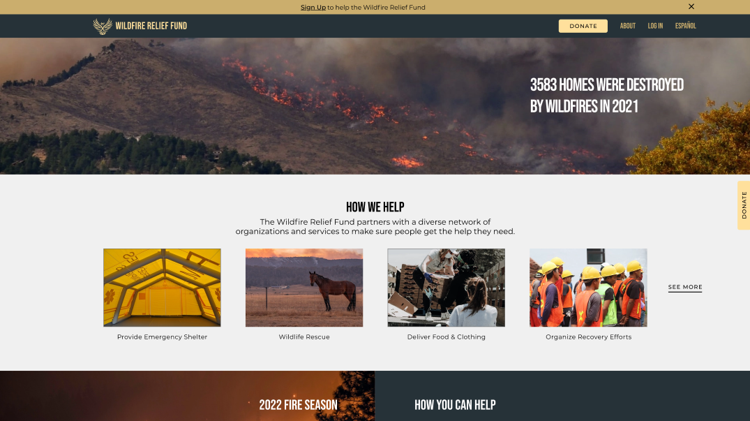
The Wildfire Relief Fund [WRF] is a humanitarian organization focused on raising donations and organizing recovery efforts for those affected by wildfires. The typical user is between 30 - 60 years old and most are located in areas prone to wildfires. The WRF’s goal is to make the sign-up process easy, clear, and engaging for all users.
Timeline: April 2022 - May 2022
Platform: Responsive Website
Role: UX Designer
Responsibilities: Foundational research, conducting interviews, paper and digital wireframing, low and high-fidelity prototyping, conducting usability studies, responsive design, accounting for accessibility, and iterating on designs

The problem
Available disaster relief websites have cluttered designs, and confusing or non-existent sign-up processes.
The goal
Design a registration flow that is user friendly by providing intuitive and easy to complete steps.
Research
User Interviews
I conducted user interviews to better understand the target user and their needs. A primary user group I identified were people who wanted to help others recover from wildfires, but multiple frustrations often prevented them from registering with existing charities.
User Personas
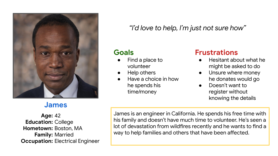
I created the persona James to help empathize with and understand the goals and frustrations of the primary user group. This helped me focus on designing a user experience that would address their needs.
User Journey Mapping
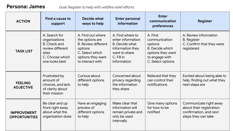
I created a user journey map of James’ experience registering with the site to help identify possible pain points and improvement opportunities.
Competitive Analysis
I conducted a competitive analysis of direct and indirect competitors to identify strengths and weaknesses of their designs. I wanted to see how they addressed the pain points I had identified. This helped me ideate a better user experience when I started designing wireframes.
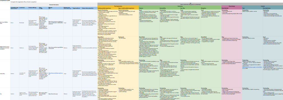
Pain Points
Navigation
Existing charity websites are visually busy, and users are unsure what aspect they should be focusing on
Registration Flow
Registration and donation flows contain numerous options that can become overwhelming and frustrating for the user
Clarity
Users don’t want to sign up or help without knowing how people will benefit from the organization
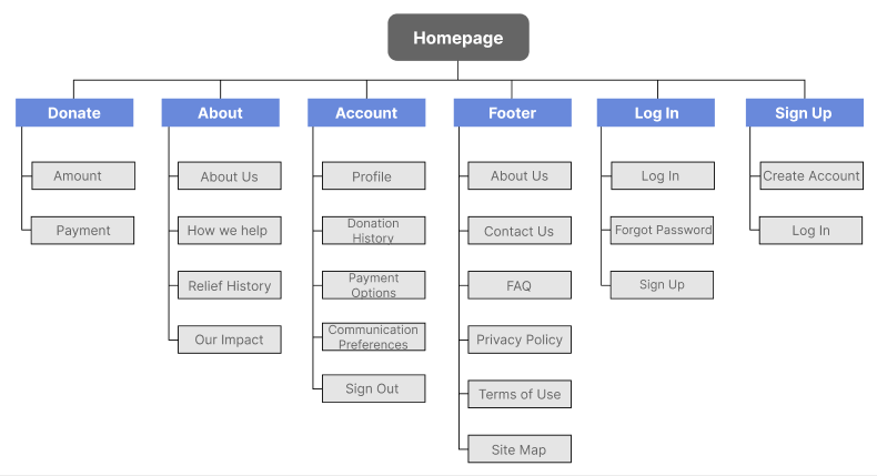
Site Map
Since website navigation was a primary pain point for users, I created a sitemap. My goal was to make strategic information architecture decisions that would improve overall website navigation. The structure I chose was designed to make things clear and easy to navigate.
Paper Wireframes
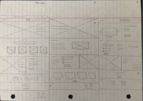
I sketched out paper wireframes for each screen of the website, keeping user frustrations about navigation, clarity, and registration flow in mind.
The home screen paper wireframes to the right focus on quickly explaining the organization, communicating ways it helps others, and focusing users on options they can take.
Home Screen (Desktop)
Paper Wireframes (Screen Size Variations)
Because the WRF user base can access the site from a variety of different devices, I worked on designs for additional screen sizes to make sure the site would be fully responsive.

Home Screen (Mobile)
Digital Wireframes
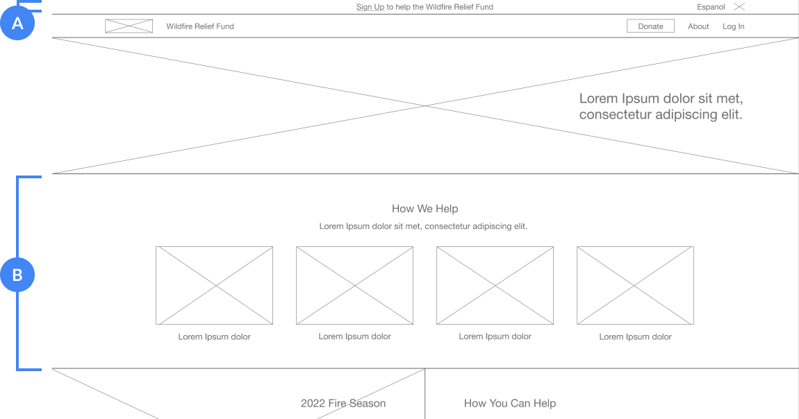
Intuitive call-to-action button placement, and keeping the page simple and engaging were key parts of my strategy for reducing user frustrations.
- A) Call-to-action alert allow users to quickly interact with site and enter registration flow
- B) Visually communicating organizational benefits help limit user confusion and keeps them engaged
Home Screen (Desktop)
Low-Fidelity Prototype
To create a low-fidelity prototype, I connected all the screens involved in the primary user flow of creating an account and donating to the relief fund.
At this point, I received feedback on my designs about things like button placement and page organization. I implemented suggestions in places that addressed user pain points.

User Testing
The usability study was done after creating wireframes in order to see if users could complete the registration flow and the insights were then incorporated into mockups.
Usability Study Findings
Donate
Some users initially tried to donate before entering the registration flow
Friction
Users were being slowed down by the number of inputs and choices per screen during the registration flow
Outcome
It wasn’t clear to all users that they had finished creating an account during the registration flow
Account Creation
Based on insights from the usability study, I made changes to improve the site’s registration flow. One of the changes I made was limiting the number of inputs or choices per screen to 2-3. I also showed password constraints upfront, and included a show/hide password feature. Lastly, I included options to sign up either via Google or Facebook. These choices reduced the friction that users had in completing the account creation process, improving ease of use and clarity, and limiting confusion and frustration.
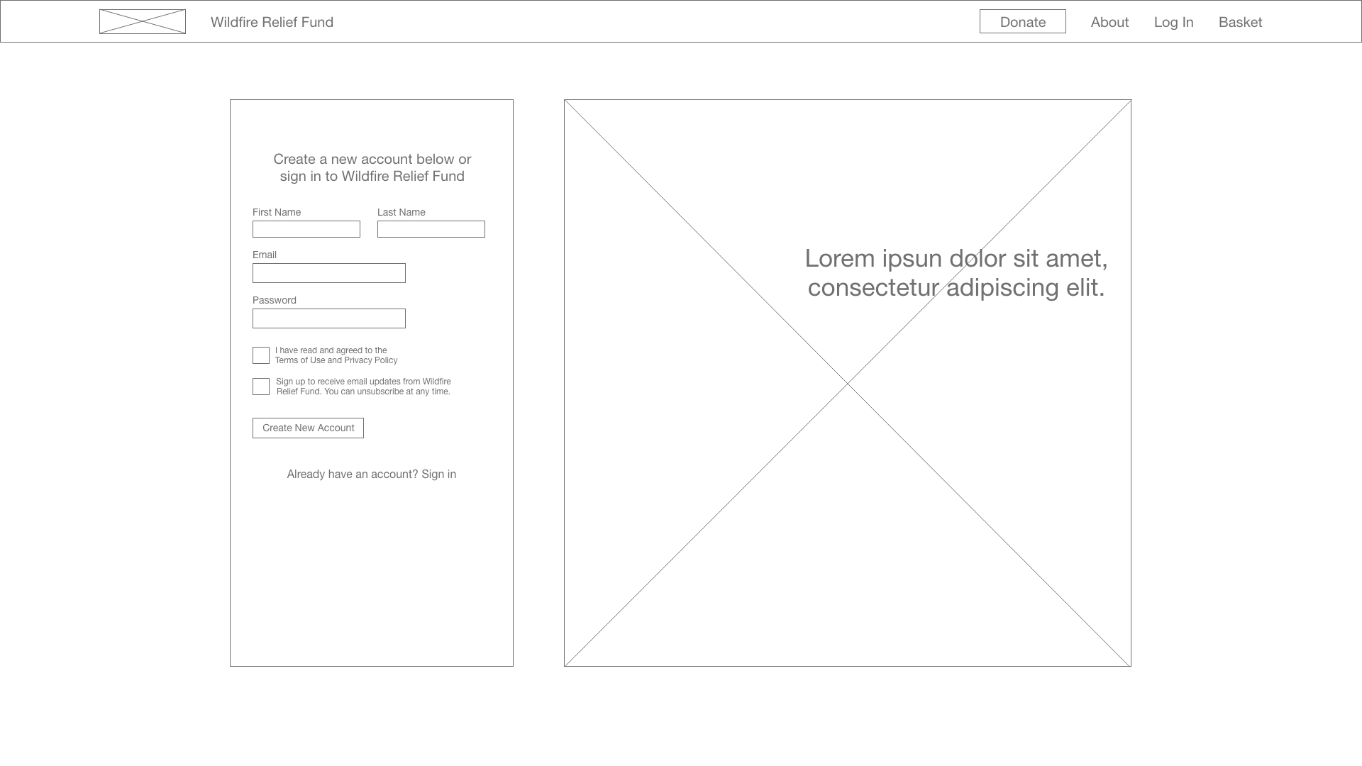
Before Usability Study
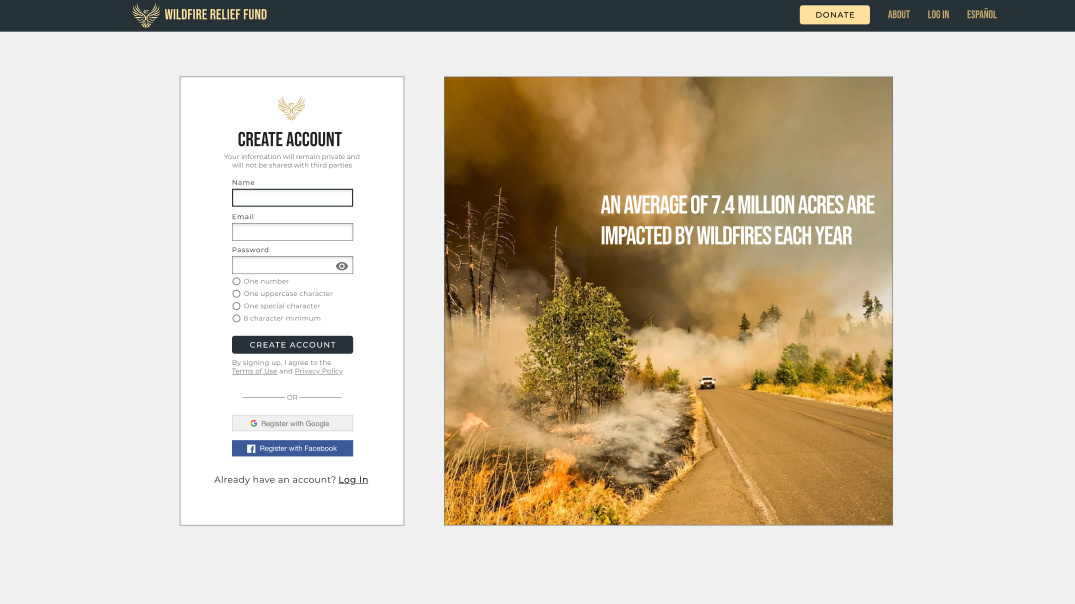
After Usability Study
Confirmation Screen
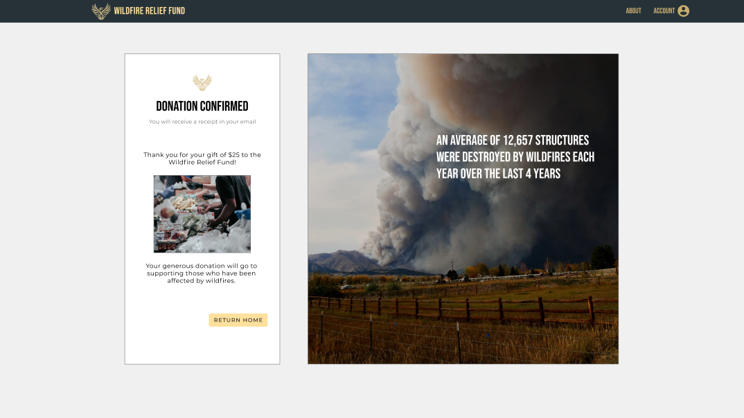
Initially I had the registration flow move right into the donation flow. After the usability study I observed this process confused users who only wanted to create an account and not donate at that time. I created an account creation confirmation screen to remedy this confusion, that still retained the option of moving on to the donation flow for those that wanted it. This change improved clarity of the registration flow and gave users more freedom in their choices.
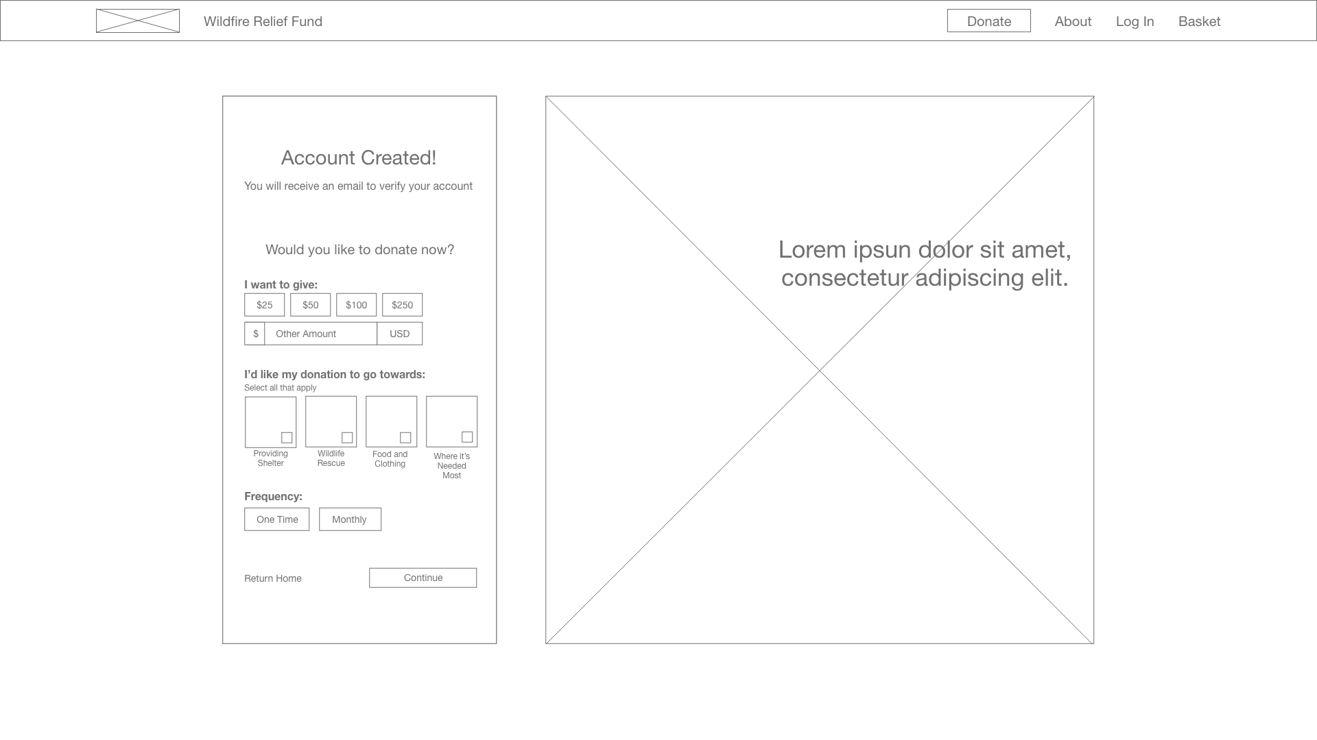
Before Usability Study

After Usability Study
Desktop Mockups


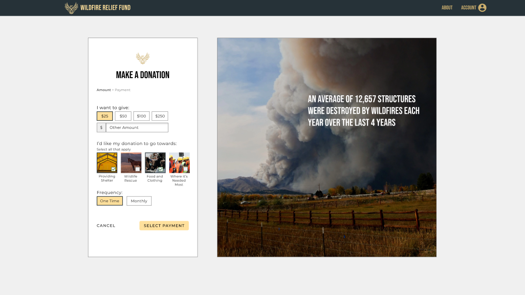
Mobile Mockups
I designed the experience to be responsive across a range of device sizes, in order to give users the best experience possible.


High-Fidelity Prototype
The high-fidelity prototype followed the same user flow as the low-fidelity prototype, and included design changes identified during the usability study as well as several others that improved the overall user experience.
View the Wildfire Relief Fund high-fidelity prototype (desktop) or the high-fidelity prototype (mobile)

Conclusion
Result
The target audience shared that the design of the registration flow was intuitive and had easy to complete steps. They had a clear understanding of what they were doing and didn’t feel overwhelmed or confused during the process.
What I Learned
I learned the importance of reducing unnecessary choices and limiting friction the user might experience during an intended flow, and to keep in mind the real needs of the user when designing a flow in order to create a better user experience.
Possible Next Steps
Conduct research to see how successful the website is at registering more users.
Recruit users with disabilities to identify potential accessibility issues.
Thank you
Thank you for your time reviewing my work on the Wildfire Relief Fund responsive website!
If you’d like to get in touch, please say hi!
claytonanderson.work@gmail.com