BookEducation
Cross Platform Design
The Product
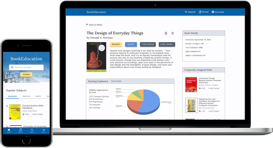
BookEducation is a mobile app and responsive website where users find highly rated educational books on any subject. Users can also request books and donate their books to other users. The typical user is between 16 - 40 years old and a student in high school or college. BookEducation’s goal is to make finding educational books easy and accessible for all users.
Timeline: 3 Weeks - May 2022
Platform: Mobile App and Responsive Website
Role: UX Designer
Responsibilities: Foundational research, conducting interviews, paper and digital wireframing, determining information architecture, low and high-fidelity prototyping, conducting usability studies, and iterating on designs
The problem
People who want to learn about a subject need an easy way to find and access highly rated, instructive, and relevant books. Unfortunately, finding this information through existing online booksellers can be difficult, unorganized, and hidden behind popular and recent releases.
The goal
Design a tool for people to easily find and access the best educational books on a given subject. Books should be organized by relevance in a field and their educational benefit.
Research
User Interviews
By conducting user interviews, I discovered a primary user group that wanted to find high-quality educational books, but felt overwhelmed in selecting options and were unsure if their search results were relevant and worth reading. Additionally, options could be expensive. These frustrations prevented them from making decisions on which books to select and they would often end their search without getting any books at all.
User Personas
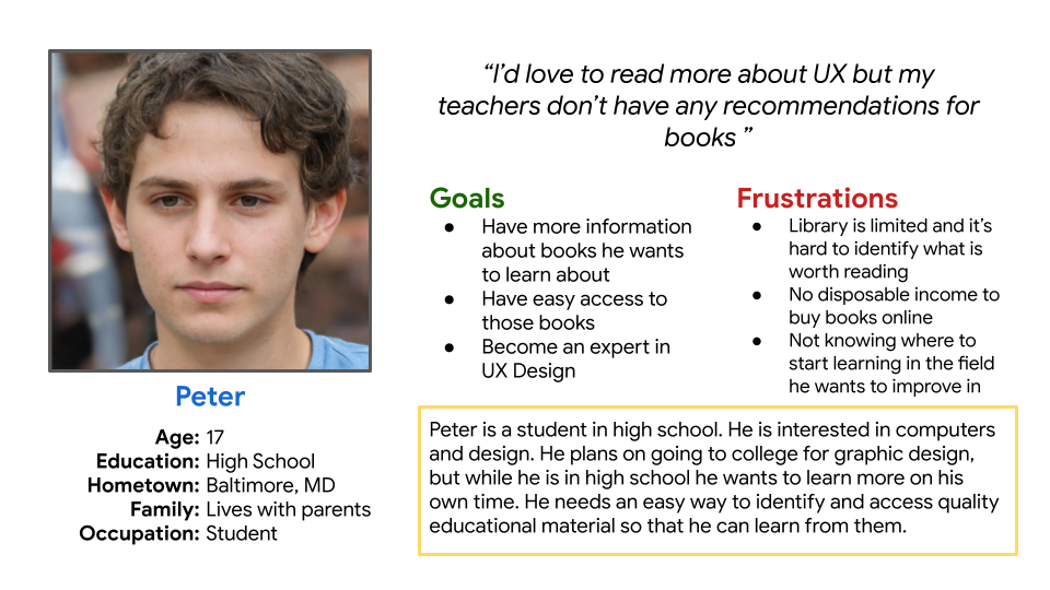
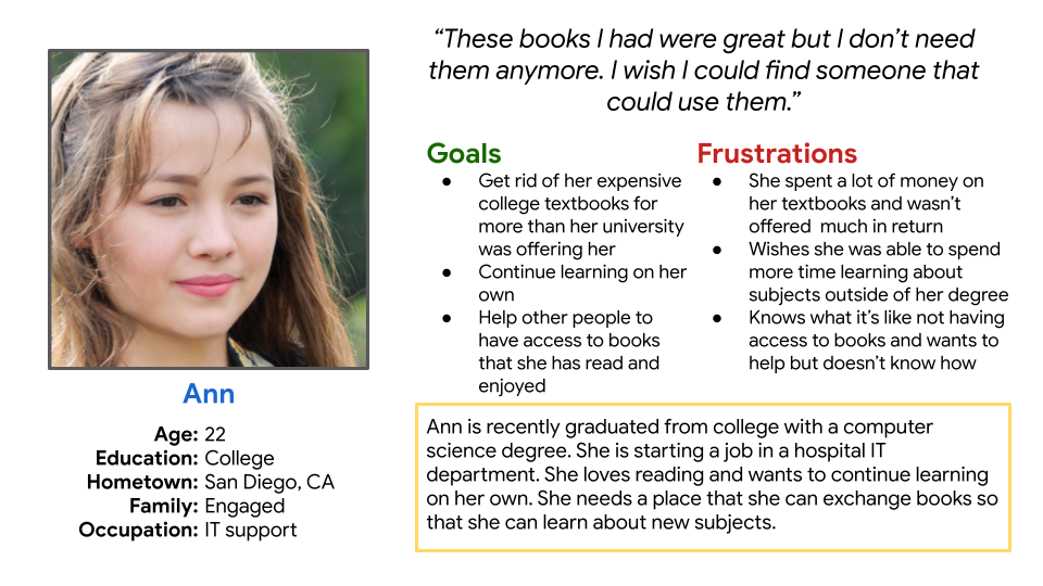
I created personas to help empathize with and understand the goals and frustrations of the primary user group. This helped me focus on designing an experience that addressed their needs.
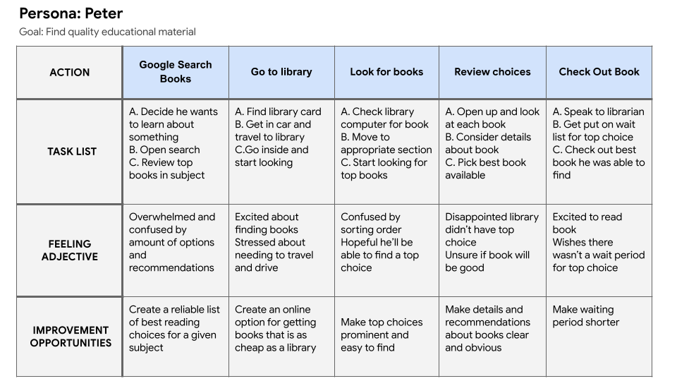
User Journey Mapping
Mapping Peter and Ann's user journeys revealed how much confusion and stress could be eliminated with a dedicated book-finding tool.
Competitive Audit
An audit of a few competitors products provided direction on gaps and opportunities to address with the BookEducation app.

Ideation
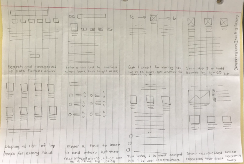
I did a quick ideation exercise called crazy eights to address gaps identified during the competitive audit. My focus was specifically on book discovery and equitable access.
Digital Wireframes
After ideating and sketching paper wireframes, I created the initial designs for the BookEducation app. The designs focused on enabling users to easily find top books on subjects they are interested in.
- A) Easy access to search field allows users to quickly enter the book discovery flow
- B) This section allows users to browse popular categories and provides recommendations for top books in those categories.
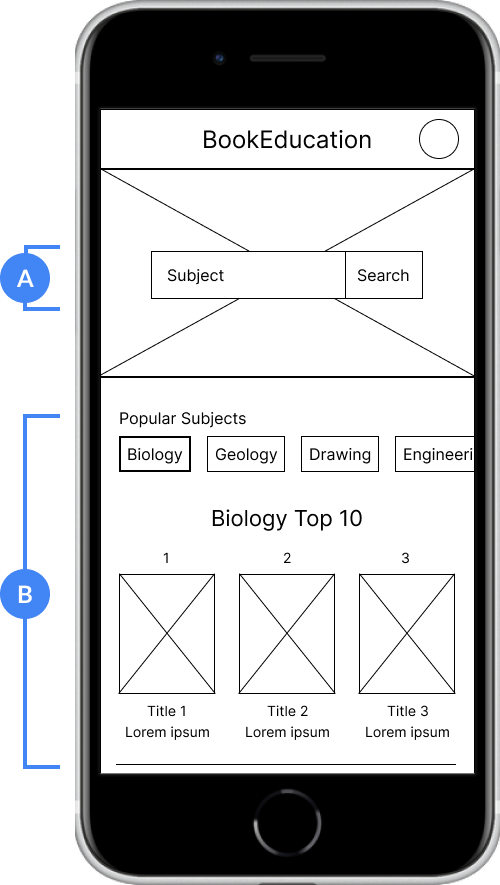
Digital Wireframe of the Home Screen
Low-Fidelity Prototype
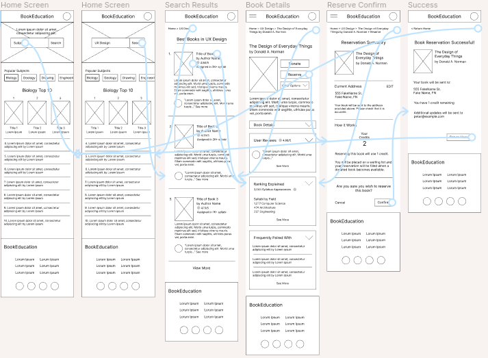
To prepare for usability testing, I created a low-fidelity prototype that connected the user flow of finding a book and requesting a copy of it.
User Testing
The usability study was done after creating wireframes in order to see if users could find and request a book and the insights were then incorporated into mockups.
Usability Study Findings
Crowded Space
Users had trouble identifying important information during the user flow because screens were crowded
Navigation
Users were not always sure where they were in the user flow or what to do next
Book request details
Users wanted more information about requesting a book, like how long they would wait, or the book’s condition
Better Navigation
Based on insights from the usability study, I simplified the site navigation into a bottom navigation bar. I also replaced the lengthy breadcrumb bar with a back button on each page of the user flow. These alterations made overall app navigation easier for the user.
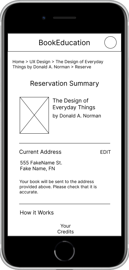
Before Usability Study
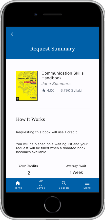
After Usability Study
Browsing Top Subjects
Additional design changes included modifying the ‘Popular Subjects’ section into a scrollable tabbed design to make navigating it more obvious and intuitive.
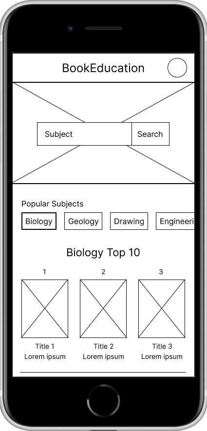
Before Usability Study

After Usability Study
Mockups
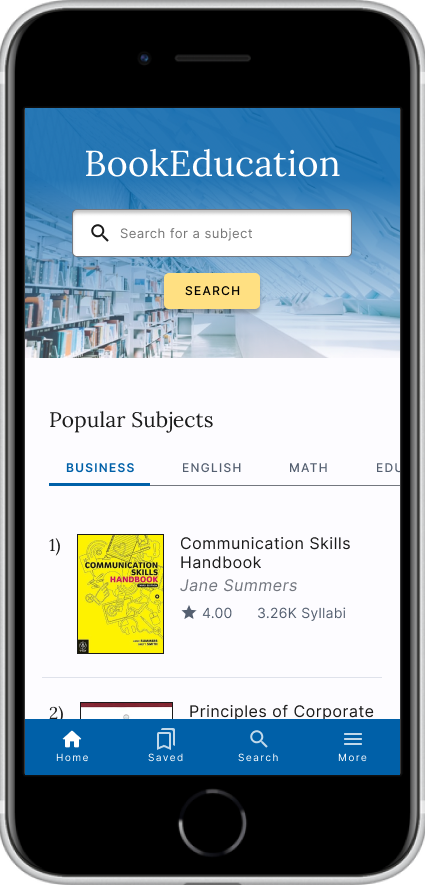
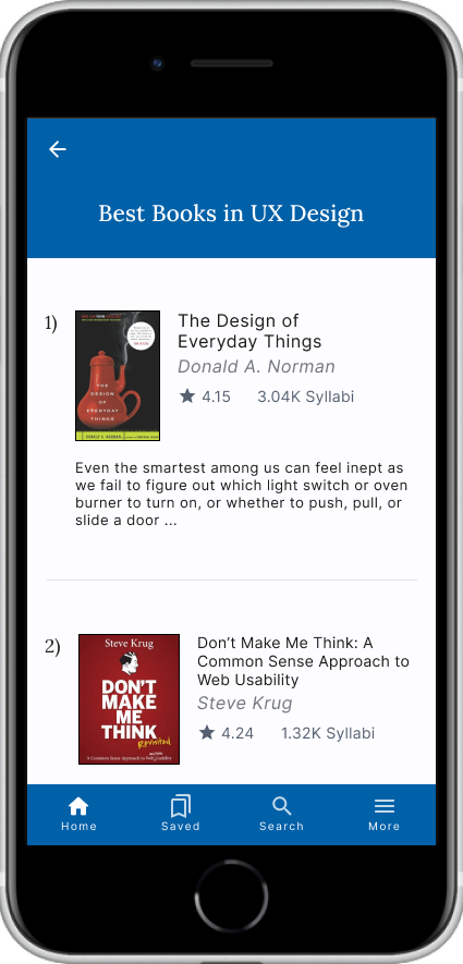
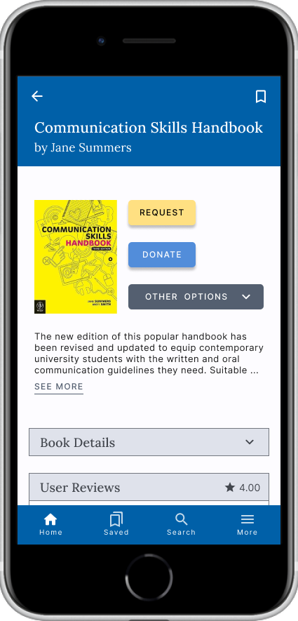
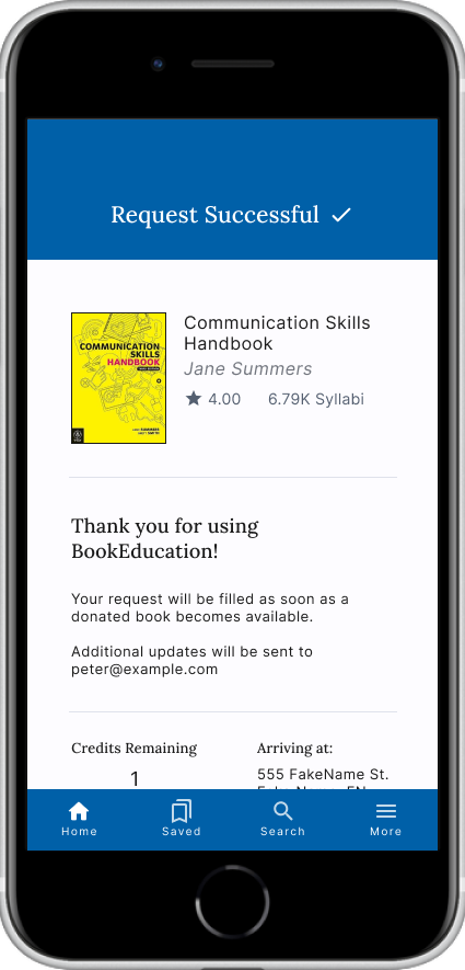
High-Fidelity Prototype
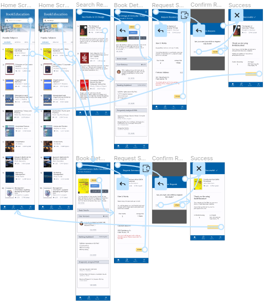
The high-fidelity prototype followed the same user flow as the low fidelity prototype, plus an additional way to enter the flow from the homescreen, and included design changes made after the usability study.
View the BookEducation high-fidelity prototype
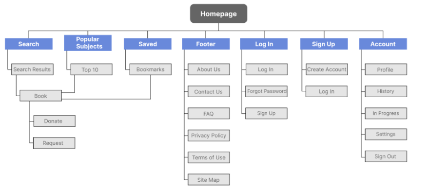
Site Map
After completing the app design, I started work on designing the responsive website. I used a sitemap to organize the structure of each screen to ensure a consistent experience across devices.
Responsive Designs
The responsive designs included desktop, tablet, and mobile sizes. I prioritized content to fit the use case and user needs of each screen size.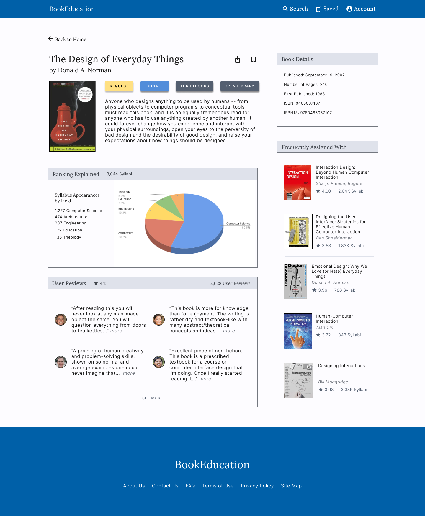
Desktop
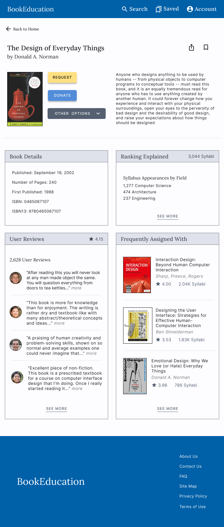
Tablet

Mobile
Conclusion
Result
BookEducation lets users find and access books that are relevant to their interests. It helps users find reading material that is instructive and highly rated. The app makes people feel like they can easily find high-quality learning material and reduces their stress and frustrations when finding new books.
What I Learned
I learned about the importance of designing for user needs with different platform considerations. Accounting for different use cases for mobile apps and responsive websites accessed on various devices is important and can make a big impact on each design and the user experience.
Possible Next Steps
Conduct research to see how successful the app is in reaching its goal to find and provide access to quality educational books for users.
Conduct a usability study with participants who have accessibility needs, to make sure the designs work for all users.
A quote from feedback: “I wish I had something like this to find books, I think I would use it. It’s a really clean layout too!”
Thank you
Thank you for your time reviewing my work on the BookEducation app and responsive website!
If you’d like to get in touch, please say hi!
claytonanderson.work@gmail.com